


You run a small studio. What do you enjoy about being on your own, as opposed to the design firm environment? Do you feel you’re missing out on anything from not being in a design studio?
I miss the scene you get at a studio. Lots of hip people turning you onto bands and clubs and whatever shoes are cool at the moment. Its nice to be part of a group, to go to happy hour together, to make out with the temps, to keep up on trendy design. But at a firm you are turning out Design Product on an assembly line, you usually aren’t actually making your own design. You get direction from the Art Director who tells you the idea and then coaches the final product out of you. Or conversely if you are the Art Director you come up with an idea and tell someone else to make it. Whoever has their name on the door is working hard to bring in high dollar work in order to keep the machine running, which often means taking monied clients who don’t really want great design. Great design is risky. Many clients prefer simply good design, which is far lower risk. I tried having employees for a while, I was miserable. I became a bureaucrat, managing deals, managing people, managing payroll. I’m a designer, thats what I do. I used to think clients wanted a big firm, and in some instances they do, but in my case I’m selling Dan Stiles. They come to me for my design, not for the design of some poor kid attempting to decipher something I sketched on a napkin because I’m too busy filling out paperwork to do the work myself.
How would you describe your creative process?
My process is always in flux. I don’t have a magic formula to knock out a home run every time by just plugging in the numbers. I don’t keep a lavishly illustrated sketch book anymore. I have one but its full of little scrawls that serve as visual notes to myself so I don’t forget and idea. The scrawls also serve as a quick feedback loop. If the idea looks like it stinks in sketch form it will most likely stink in any other form as well. Best not to pursue it. I do a lot of experimentation, sometimes at a computer, other times with bits of cut paper and glue. These studies often provide the visual basis of later work. They provide the form, although sometimes they can provide the concept as well. I create something, sit back and look at it, and begin to see things in the shapes, then I rework it. It’s like I’m stalking an idea through a maze of shape and color. Other times I use the more straightforward approach of coming up with a concept, then sitting down and executing it. But even when I do it that way there is always a process of discovery. I need to get in there and work something before its final form becomes clear to me. For that reason I never send pencil sketches to clients. By the time the final piece is done it most likely won’t look much like the original sketch.
Who and what are some of your biggest influences?
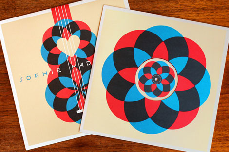
I have a mash up of different influences, I guess everyone does. Obviously I love modern design, but I do my best not to simply be a present-day practitioner of a historical style. I didn’t set out to create art that looks this way. Largely my current style was created by the act of creating designs for screen printing and working with the screen printing process. Minimal color because every color in a screen print is another screen, another pass through the press, more time, and more money. Large color blocks which came from cutting rubylith color separations by hand in the old days. Overprinting is a big part of my process (printing one ink on top of another to create a third color) this started out as economically maximizing the impact of two colors of ink. I also don’t use a black trap line like many illustrators. That came about via experimentation, I came to the conclusion that line art was unessary for what I’m trying to do. I don’t draw a picture and then color it in. The colors and their shapes are the picture. I realized pretty early on that my work was headed in a modern minimal direction, and I embraced that. Now I sometimes revisit themes that were popular among modernists, recently it’s been stacked shapes, but I try and make them my own.
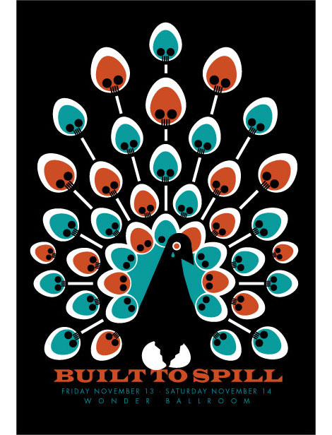
I blame my entire life path on discovering punk rock when I was 14. The art, the DIY attitude, the music, it all had a profound influence on me. I think you can still see it in there. I have a friend who jokes that I draw skulls for a living, which is pretty much true. The style has become more refined than when I started out copying the Misfits Fiend, but the substance is the same, albeit a little softer these days. I’m just not as angry as I was back then, life is pretty good.
Having spent several years designing logos at a major firm in San Francisco helped me to be able to distill an image down to it’s essence, which has become a large part of my style. Logos and posters have a lot in common. They have both have to communicate a message in one quick punch, only they do it at different scales.
Beyond that I would cite textile design, japanese design, pop culture, old comic books, cartoons, vintage packaging, modern art, african art, ancient art, art deco, art nouveau, and a bunch of other stuff I can’t think of at the moment.
What’s next in the world of Dan Stiles? Any rad upcoming projects?
My goal is to productize more of my work. I’m looking to expand out of the music market because there are so many cool things to design in this world. I have a line of fabric coming out in the fall with Birch Fabrics (http://www.birchfabrics.com/). I have a company that I’m talking to about greeting cards. My wife Melissa designs metal jewelry (http://www.stubbornworks.com). She and I are collaborating on a few three dimensional products, last year we did a set of stainless steel christmas ornaments that sold really well. Within the world of music I have the second vinyl release from the BCWax (http://bcwax.com/) label coming out soon, that’ll be cool. We’re doing a whole series of limited edition vinyl records. I’m also starting to do book jackets.


 Above are 8 individual booklets 6 interviews and the other 2 about print processes and finishings. They are held in a greyboard sleeve that has been cover in a black vinyl buckram and another sleeve holding the booklets.


 found here.


 'A book produced to inspire clients with Moore's enhanced digital print capability. Whilst giving the reader a visually enthralling natural history lesson, the book clearly illustrates a surprising range print possibilities.' found here.


 I have decided to change my original idea from just creating an a5 publication and instead I am now creating 8 individual booklets with a hot dog fold, to open out as a poster with an appropriate quote.below is an example of the poster...
 Inside the booklet...
 I have kept the layout quite simple as I think it works better this way so that I can have images aswell which will all be mono tone.
 For my design context book I knew i wanted to create a publication and these are some of the formats that i have been looking at...
 All three books would be bound together with a paper belly band.
 above is of a similar format to the ones above but having all the layouts bound within one booklet rather than three separate ones.


